

Putting Covid-19 in India in perspective

Among the many casualties of the Covid-19 pandemic is the complete loss of objectivity and any sense of proportion. Currently, the entire world including Indians have become hysteric about the supposedly devastating second wave of Covid-19.
As I have explained elsewhere part of the hysteria in Western nations is certainly the result of either overt or covert racism.
Somehow we seem to believe that Indians are more likely to bring Covid-19 with them compared to citizens reporting higher case rates.
Some have argued flights with very high number of positive cases have shown up from India. This is primarily the result of extrapolating from small samples. Most people believe that even small samples will display the same pattern as very large samples.
So, if one flight from India shows up with lots of positive cases then that must tell us something about the distribution for the country as a whole. This is a fallacy. Just by random chance you can get a lot of flights with very low numbers and some with very high numbers.
If you look at the pattern of ten consecutive births at Auckland City Hospital over many days then it is entirely possible that some days will throw up lots of boys or lots of girls by random chance. There is no reason that small samples will always reflect the properties of the overall distribution. Extreme outcomes are much more likely with small samples.
So, what we need to look at the are the numbers arriving from Covid-19 with positive RT-PCR tests (assuming those tests are definitive for Covid-19, which they are not) as a fraction of those arriving from India and see if this is significantly different from the numbers arriving from other countries. I am willing to bet that the answer is that these proportions are not different. I could look this up but I have decided to save myself the trouble since I doubt this is going to make a difference. The goal posts will merely be shifted to accommodate the received wisdom.
Figure 1 provides an overview of Covid-19 cases per million around the world. A few things are clear. First any potential increasing trend in India is not that different from the trends in other countries now or in the recent past. The proportion of cases in India remains a fraction of that in a country like France. Second, the trend is beginning to flatten out.
Figure 1: Covid-19 cases per million in a selection of countries.
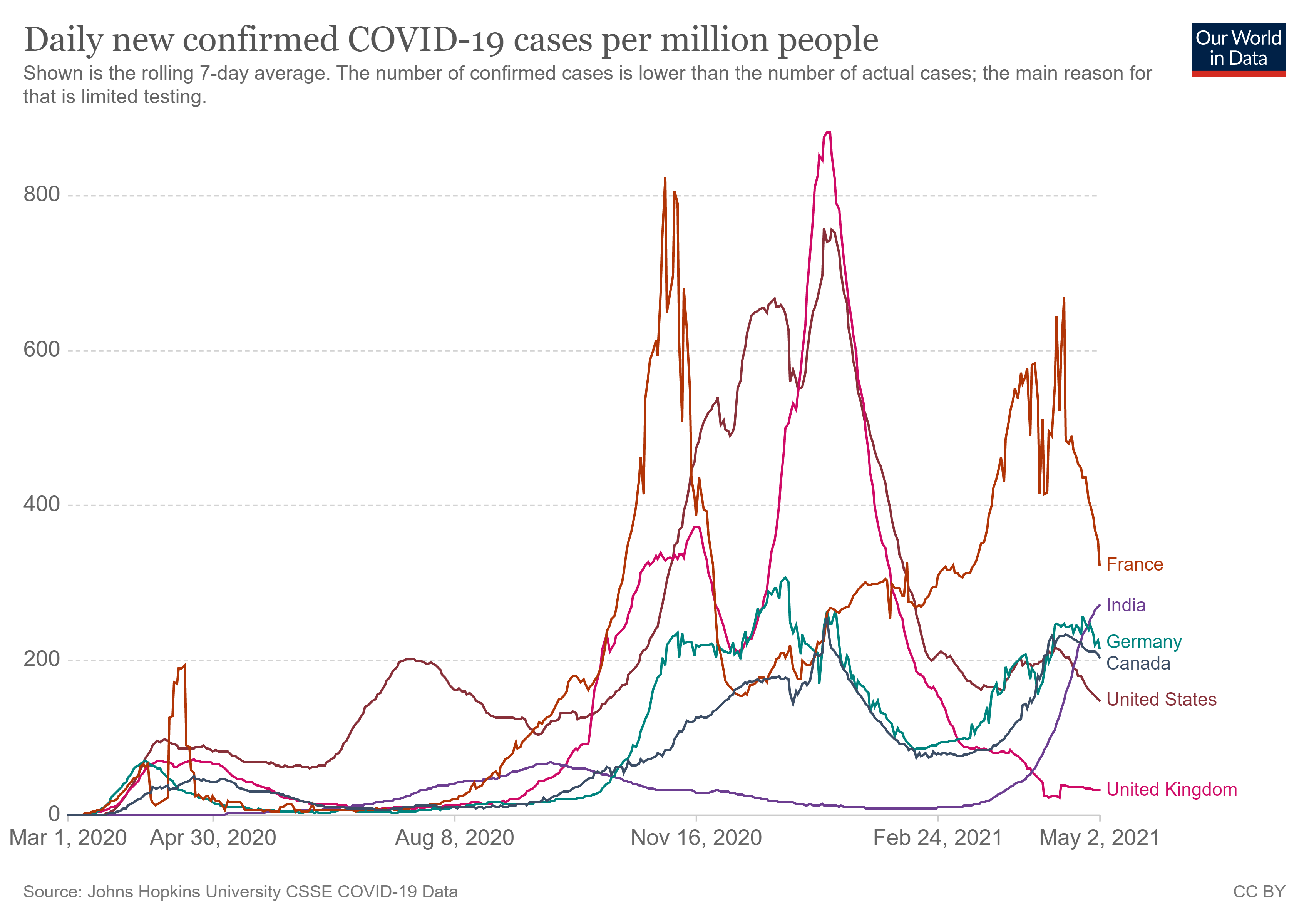
Figure 2 provides an overview of deaths per million. Once again there is nothing extra-ordinary here. Deaths per million in India are still lower than peaks attained in other countries. Now that cases are flattening out, so will deaths.
Figure 2: Covid-19 deaths per million in selected countries

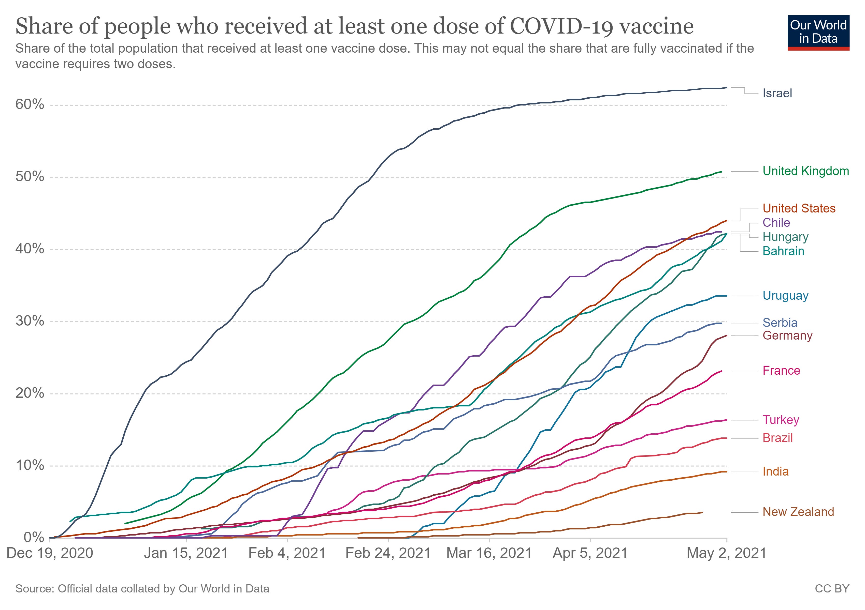
Figure 3 shows vaccinations rates. If these statistics are correct then India has managed to vaccinate around 9% of its population. This is 90 million people. New Zealand on the other hand has managed just under 4%. This is around 200,000 people. Israel has managed around 62%. With a population of 9.2 million, which is about 57 million people. So, India has managed to vaccinate more people than Israel, which, in terms of vaccination rates, is ahead of every other country in the world.
Figure 3: Covid-19 vaccination rates in different countries
Now, maybe it is not bias or feelings of self-preservation but rather genuine concern that is motivating people all around the world to seek assistance for Indians.
Recently India’s Supreme Court directed central and state governments to implement lockdowns to break the chain of transmission. A similar view has been espoused by Anthony Fauci of the CDC.
The fallacy of this position has been highlighted so many times but I guess it is worth reiterating: the cost of lockdowns exceed their benefit. I can cite volumes but here is work from David Miles of Imperial College London (yes the same ICL that gave us the original report from Neil Ferguson that set us down this path to lockdowns.)
This is particularly true of countries like India with relatively younger populations.
In figure 4, I present data on median age across countries and deaths per million. The vertical bars in the background show the median age. I have arranged this in ascending order of median age and this is measured on the left-hand axis. So, at the extreme left we have Niger with a median age of around 16 (50% of Niger’s population are less than 16 years old while the remaining are more than 16 years old). Countries like Democratic Republic of Congo, Gambia, Senegal, Burundi, Tanzania, Zimbabwe or Liberia have fairly young populations as well. Space constraints prevent me from showing the names of all the countries represented. At the other extreme we have San Marino with a median age of 45. Other countries with relatively older populations include Japan, Italy, Portugal and Spain. Rich, western, industrialized nations have much higher proportions of older people among their population. There are more than 100 countries in the world where the median age is less than 30. This means that 50% of the population of these countries are less than 30 years old. On the other hand most of the countries in the “West” have “older” populations with median age of 40 or more. The solid jagged line shows the death rates per million across different countries. There are lots of ups and down here but the pattern is clear. (The dashed line is the linear approximation of the solid jagged line.) Deaths per million increased with an increase in the median age. Countries where fifty percent of the population are under the age of thirty had very low mortality. The mortality rate climbs sharply as the population got older.
Figure 4: Median age and death per million from Covid-19 across the world
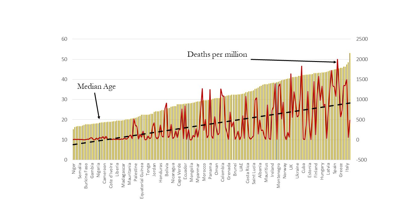
Of course, there are outliers. Some countries like Iran, Mexico, Bolivia, Ecuador, Peru or Panama which have a relatively young population have reported high death rates. South Africa is also a huge outlier with a relatively young population but a relatively high death count of 774 per million. I will have a bit more to say about South Africa shortly. At the right-hand end we also have outlier countries with much higher mortality rates compared to other countries with similar media age. This list will be less surprising and includes countries like Italy, San Marino, France, UK, Belgium and the Czech Republic. But equally Japan with one of the older populations in the world has exhibited a much lower death rate. But the basic patten remains undeniable. As the median age increases and a country’s population gets older on average, the death rate soared. On average, a one-year increase in median age will lead to 71 more deaths per million. This is striking given that the public health systems in most of the developing countries on the left-hand side of this chart are rudimentary to say the least.
In Figure 5, I have blown up the left-hand side of Figure 4 in order to focus on fifty-nine low Covid-19 incidence countries, mostly countries in Africa with a smattering in Asia and Latin America. As before the vertical bars show the median age across the different countries. This is arranged in ascending order and is measured on the left-hand vertical scale. The deaths per million are shown by the solid jagged line and are measured on the right-hand vertical axis. Again, there are outliers such as Swaziland, Palestine, Iraq, Guatemala, Jordan and Honduras. But, for most of the rest, more than fifty countries that death rate is around 100 per million or less, i.e., about 1 in 10,000.
Figure 5: Median age and death per million from Covid-19 in low incidence countries
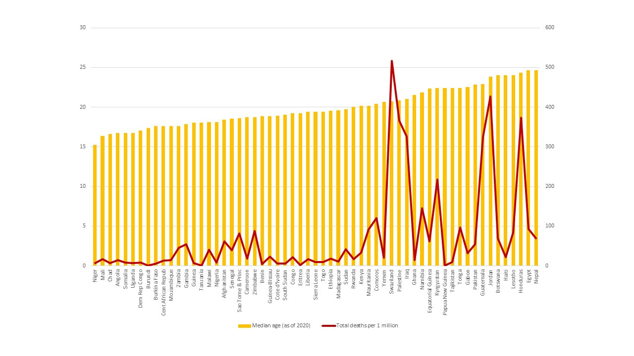
This, in turn, implies that many of the countries located in the left-hand side of this chart with relatively younger populations could have done very little (and quite possibly did little) and the outcome would not have been dramatically different. According to John Ioannides of Stanford, for some of these countries the infection fatality ratio from Covid-19 is to the order of 0.09%, which is less than 1 in 1000 (about 9 in 10,000), while for some others the infection fatality rate is around 0.2%, which is around 2 in every 1000. Compare this to Belgium with a median age of 42 and 1837 deaths per million.
For many developing countries there are other, far more imminent threats to life including HIV/AIDS, malaria, cholera and tuberculosis. Covid-19 did not pose that much more of a health threat to these countries. South Africa has reported approximately 49,000 deaths from Covid-19 over the course of 2020. In 2019, about 72,000 people died from HIV/AIDS. Of course, some of these will be chalked up to Covid-19 but most people with HIV/AIDS who are immune-compromised will die from a multitude of other causes such as tuberculosis. According to the World Bank, 1 in every 5 South Africans between the ages of 15 and 49 suffers from HIV/AIDS. The HIV prevalence rate for adults aged 15 to 49 was 37% in Swaziland, 25% in Lesotho and 25% in Botswana. Since 1985, more than 2 million people have died of AIDS in South Africa.
Here are some more figures for those who feel devastated by the Covid-19 toll.
Till now, around 220,000 people have died from Covid-19 in India. In 2019, there were 2.6 million cases of Tuberculosis and 436,000 deaths. Tuberculosis is also a highly contagious disease.
According to a 2012 paper published in the Bulletin of the World Health Organization, annually about 334,000 children died from diarrheal diseases around that time, the leading cause being the Rotavirus.
India became the first country in Asia to launch Rotavirus vaccine in the Universal Immunization Program (UIP) in March 2016.
According to the WHO, which, albeit belatedly has begun to realize the downside of extensive lockdowns, one collateral damage from the excessive focus on Covid-19 and its attendant lockdowns is that millions of children in India and elsewhere are missing their vaccinations. This is leading to a resurgence of easily preventable such diphtheria, measles and polio.
So, why the angst over Covid-19? Is it because all of a sudden we have a disease that is claiming the lives of the well-off as opposed to the deaths that are part and parcel of the lives of the poverty-stricken?
In this regard it is also worth bearing in mind that the vast majority of Covid-19 casualties are older, most with other co-morbidities.
I will leave it to readers to decide whether this is really a good or acceptable trade-off: because let us face it, lives will be lost either way.
This post is full of so many propagandistic gems (aka right-wing Indian BS) that I am afraid to say that I'd have liked the author to own at least an ounce of common sense. Sadly, there is too little to offer. For example, the reported number of daily infections and deaths in India are so absurdly underreported, a fact that gains infinitely more prominence during the second wave than the first, and the author keeps on hammering in his post, that I find the post to produce almost comical effects and a brave exhibition of the author's distorted views.
Great comment. I argued the same in my article in TOI last may 2020